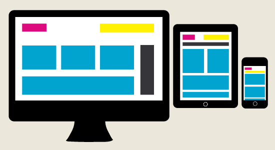
In the largely dynamic field of web design and development, website designers are having a hard time keeping up with the endless new resolutions and devices. Creating a website version for every resolution and device is at impractical to say the least. Designing responsive websites is increasingly becoming the area of standard practice. This paradigm shift feels like a fundamental transition from table-based layouts to CSS.
Responsive web design is an approach, which expects design and development to respond to user’s behavior and environment. The screen size, orientation and platform are designed to match up to the user’s preferences. Creating a responsive website involves a combination of flexible grids & layouts, images and a smart application of CSS media queries. For example, as user switches from his laptop to iPad, the website should ultimately switch to create room for resolution, image, size and writing abilities. This ideally is ‘responding’ to the user’s needs, which removes the necessity for different design and development for each gadget on the market. There are several things that one should bear in mind when creating a responsive website:
Flexible grid system and background images
Grid systems used in magazines need to be applied in responsive websites as well. Inorder to have a flexible layout, you need to provide the measurements in percent, not pixels. This implies that 50% breadth will always account for half of the screen showing the website regardless of the device. Fluid grids are an essential aspect of creating a responsive design. When the width of the browser becomes narrow, the design can begin to disintegrate; this however can be solved using media queries. If using background images, you have to select the right photographs that can be tiled into proper grid systems.
Scale everything down
This means that the fixed width approach used on the grid system has to disappear precisely like the horizontal scroll. Instead of this, try to insert web information in a way that if you adjust the size of the browser, all the information will be visible. With a flexible system made in percent, this will be easy. The effect of rigid web pages is that they are poorly displayed on a mobile device.
CSS3 Media Queries
Currently, this enjoys a quantifiable amount of support across many modern browsers. The CSS3 media queries allow you to collect data about the site visitors and use it to provisionally apply CSS styles. From a more practical angle the resolutions that design targets will be found on the resolutions of the people using that particular design, time and budget limitations. When deciding on the resolutions to target, use your logic. Targeting many resolutions will consume more time.
In conclusion, responsive web design should not be about how to create a fluid layout on a wide range of platforms and screen sizes, it should be centered on the user’s ability to pick and select content. CSS has provided for this allowing the web designers to show and hide content with ease.


